Metric Cards Hero
A centered hero with a huge heading over artwork, a CTA, a client logo row and three overlapping metric cards (glass and accent) that can open a detail.
npx shadcn@latest add https://ui.develop-better-solutions.com/r/metric-cards-hero.jsonDependencies:
lucide-react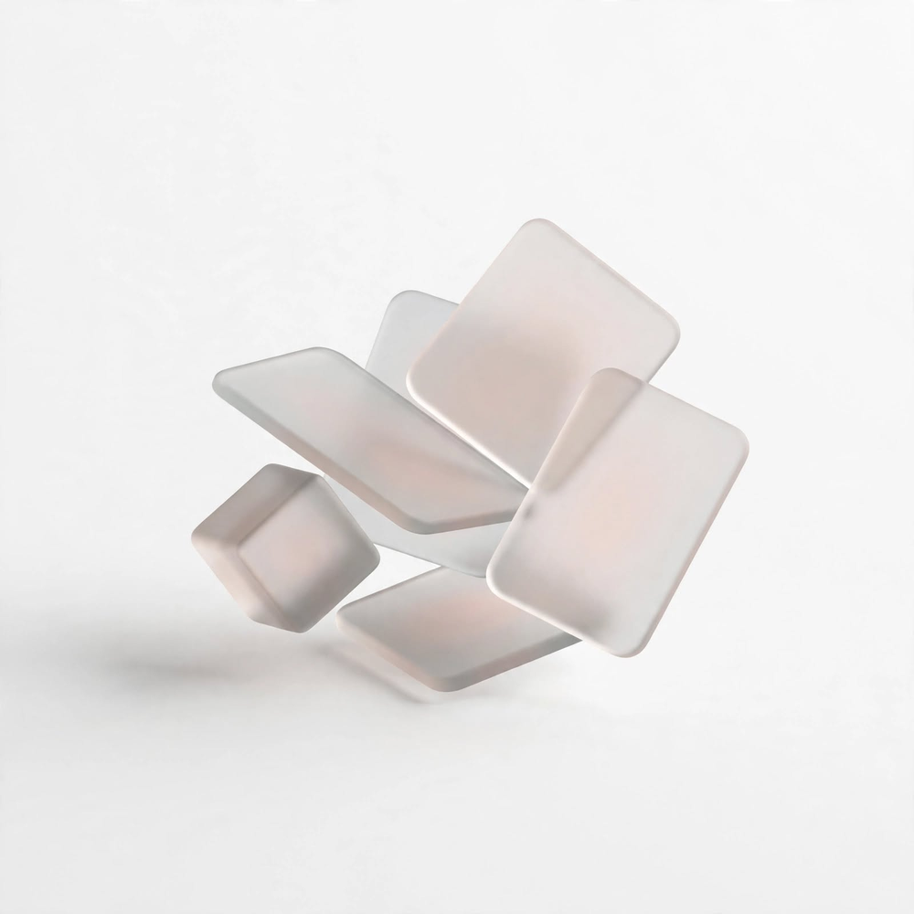
With Perkly,
you have the edge.
Turn employee benefits into the key to your success.
HR teams across industries grew with us (sample companies)
NorthwindAlderBrightlyCobaltHalo
Usage
metric-cards-hero-example.tsx
"use client";

import { MetricCardsHero } from "@dbs/ui";

const LOGOS = ["Northwind", "Alder", "Brightly", "Cobalt", "Halo"];

export default function MetricCardsHeroExample() {
  return (
    <MetricCardsHero
      title={<>With Perkly,<br />you have the edge.</>}
      artwork="/samples/mosaiq-hero-glass.png"
      lead="Turn employee benefits into the key to your success."
      action={<a href="#" className="inline-flex min-h-11 items-center rounded-full bg-ink px-7 text-sm font-medium text-canvas">Talk to an expert</a>}
      logos={{
        caption: "HR teams across industries grew with us (sample companies)",
        items: LOGOS.map((n) => <span key={n} className="text-lg font-semibold tracking-tight">{n}</span>),
      }}
      metrics={[
        { value: "9", text: "of 10 employees open their benefits app every week.", onSelect: () => undefined },
        { value: "62%", text: "higher perceived value of employee benefits", tone: "dark", onSelect: () => undefined },
        { value: "27%", text: "savings from centralising every benefit", onSelect: () => undefined },
      ]}
    />
  );
}