Product Panel Hero
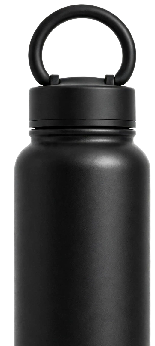
A tall dark card hero for one product: big heading and quiet link, a tall product cut-out at the lower right, a light panel slot bottom left and a round scroll arrow.
npx shadcn@latest add https://ui.develop-better-solutions.com/r/product-panel-hero.jsonDependencies:
lucide-reactThe simpleBottleWater
Usage
product-panel-hero-example.tsx
"use client";

import { ShoppingCart } from "lucide-react";
import { ProductPanelHero } from "@dbs/ui";

export default function ProductPanelHeroExample() {
  return (
    <ProductPanelHero
      title={["The simple", "Bottle", "Water"]}
      subAction={{ label: "More offers", onClick: () => undefined }}
      image="/samples/clearbrook-bottle.png"
      imageAlt="A matte insulated bottle"
      onScroll={() => undefined}
      panel={
        <>
          <a href="#" className="flex min-w-[130px] flex-1 flex-col justify-center px-3 text-left hover:bg-black/5">
            <span className="text-[10px] uppercase leading-none text-ink-subtle">Shop</span>
            <span className="mt-1.5 text-[17px] leading-none tracking-tight">All Products</span>
          </a>
          <button type="button" aria-label="Open cart" className="flex w-[61px] items-center justify-center border-l border-line hover:bg-black/5">
            <ShoppingCart className="size-[22px]" strokeWidth={1.5} aria-hidden="true" />
          </button>
        </>
      }
    />
  );
}