Product Gallery
A product image gallery: crossfading main frame, hover zoom to the pointer, swipe and arrow keys, and a thumbnail strip below or beside.
npx shadcn@latest add https://ui.develop-better-solutions.com/r/product-gallery.json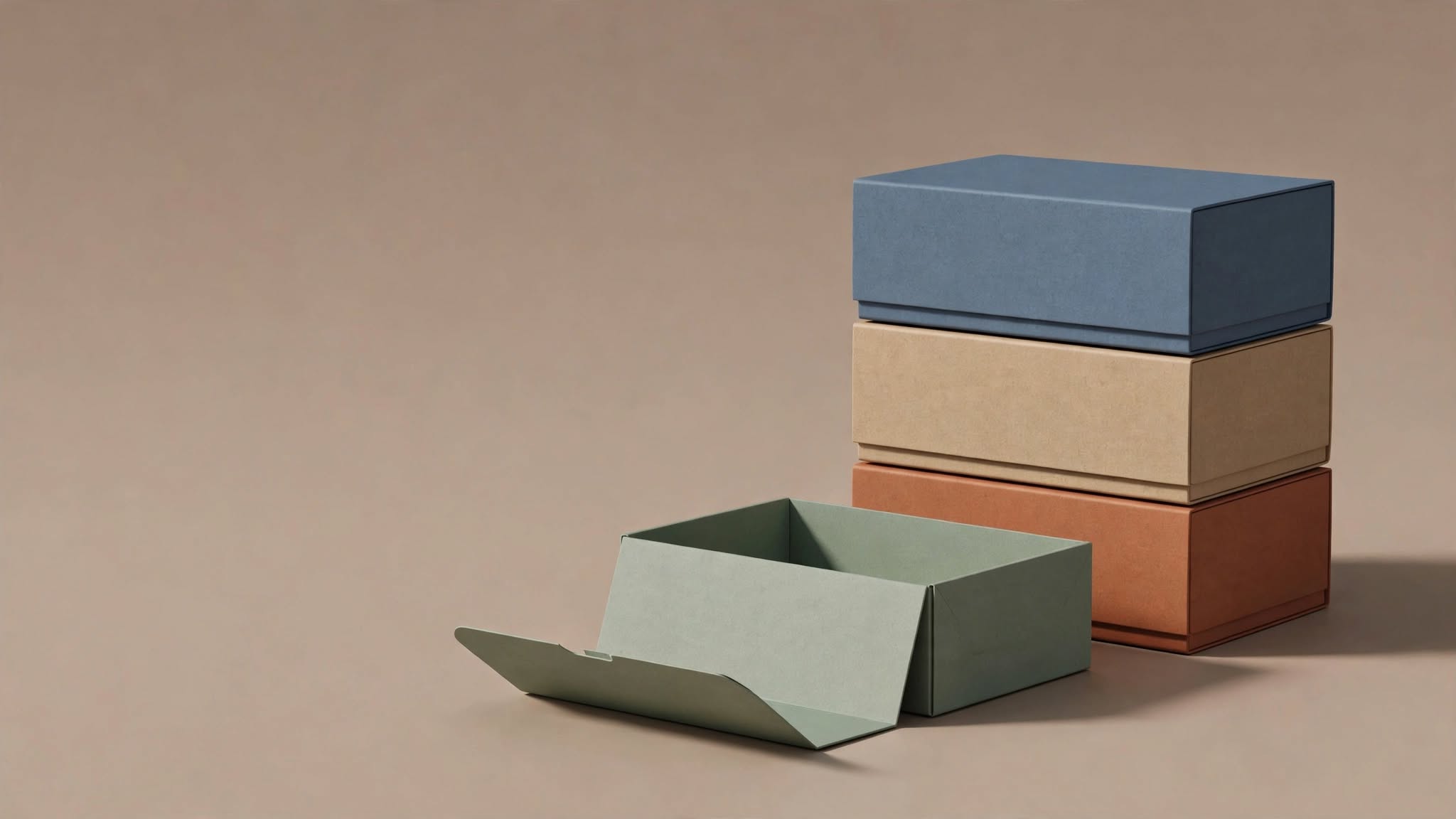

NEW
Usage
product-gallery-example.tsx
import { ProductGallery } from "@dbs/ui";

const IMAGES = [
  { src: "/samples/steps-boxes.jpg", alt: "Stacked boxes, front view" },
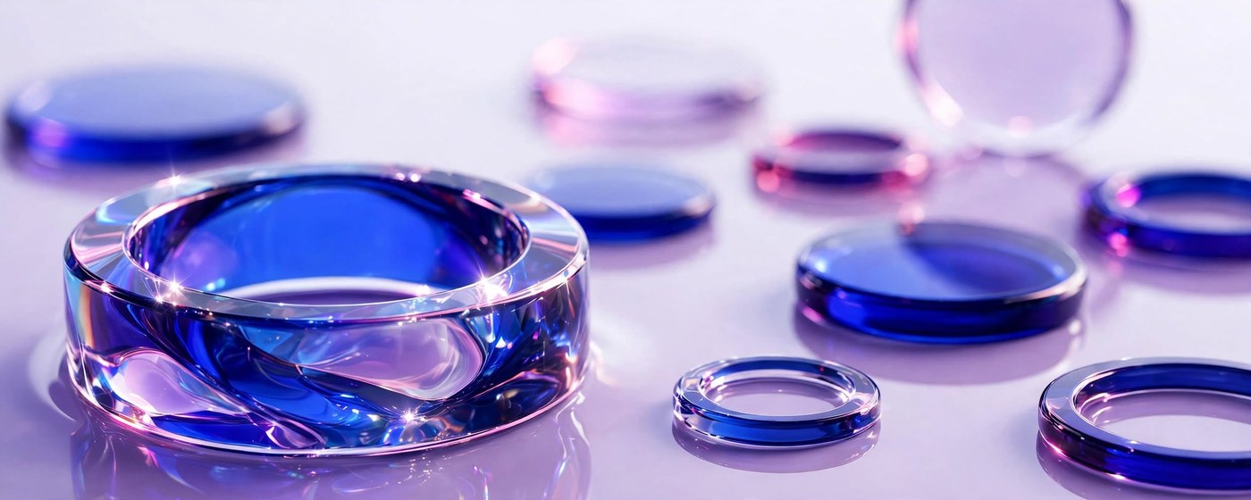
  { src: "/samples/approach-glass.jpg", alt: "Glass discs, detail" },
  { src: "/samples/torus.png", alt: "Glass torus, side view" },
];

export default function ProductGalleryExample() {
  return (
    <div className="w-full max-w-md">
      <ProductGallery
        images={IMAGES}
        badgeStart={<span className="bg-ink px-2.5 py-1 text-[11px] font-semibold tracking-wide text-canvas">NEW</span>}
      />
    </div>
  );
}